UI/UX Design
Hill's Browse by Condition
Helping veterinary professionals find the right nutrition for their pet's specific health condition — without getting lost in a 200+ product catalog.
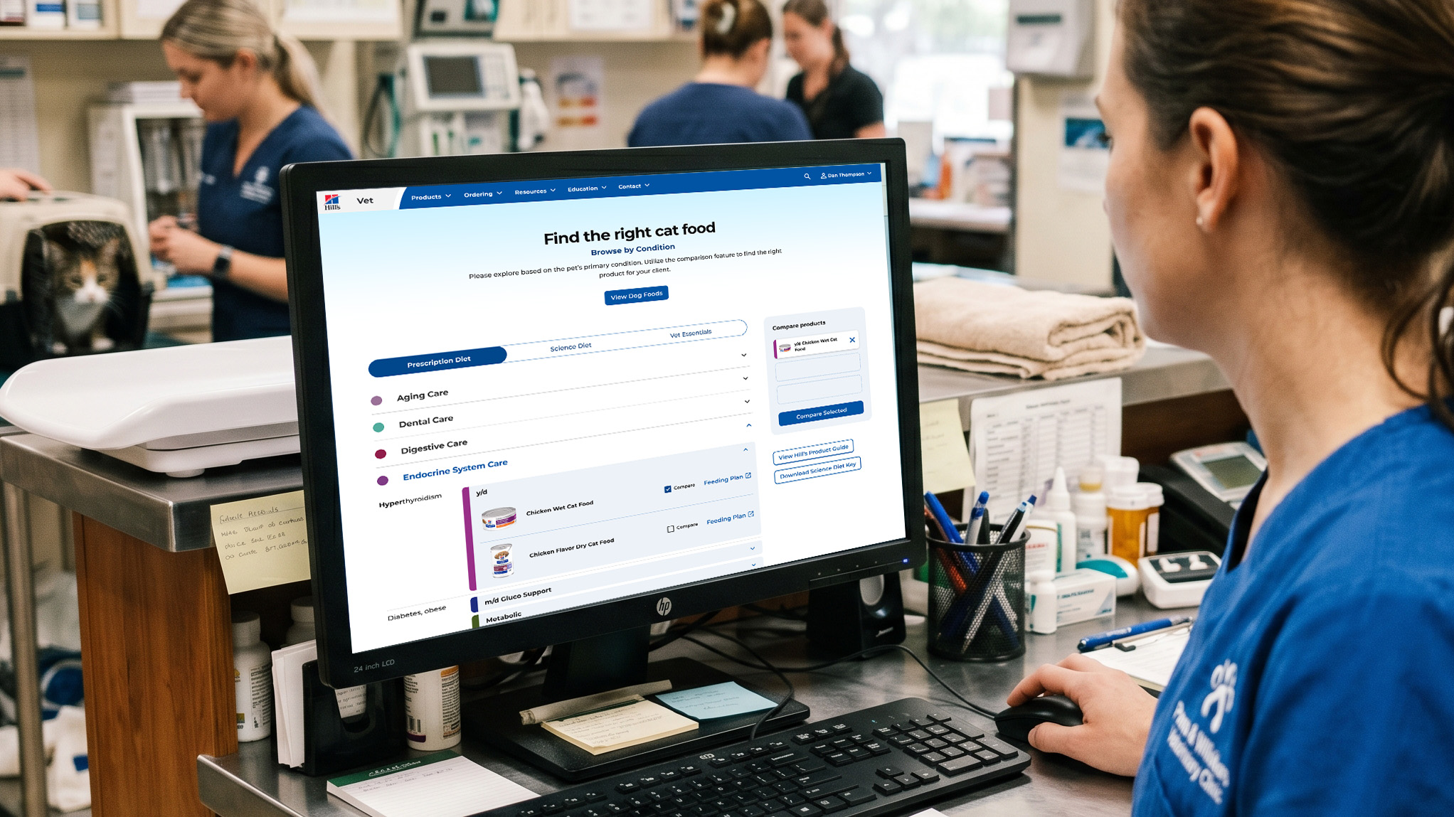
Updating a go-to tool for veterinarians on hillsvet.com
Hill's Pet Nutrition operates two parallel web presences: hillspet.com for consumers, and hillsvet.com for veterinary professionals. The vet-facing site is a clinical tool — vets use it to look up therapeutic nutrition options for their patients, compare products, and build feeding plans.
The "Browse by Condition" page is a frequently-used tool on hillsvet.com. It lets veterinary professionals find the right Hill's product based on a patient's primary condition and any concurrent secondary conditions — navigating across both the Prescription Diet and Science Diet product lines. The page needed a full redesign to address usability problems, introduce new features requested by the client, and bring the interface up to modern accessibility standards.
Gaps in useability
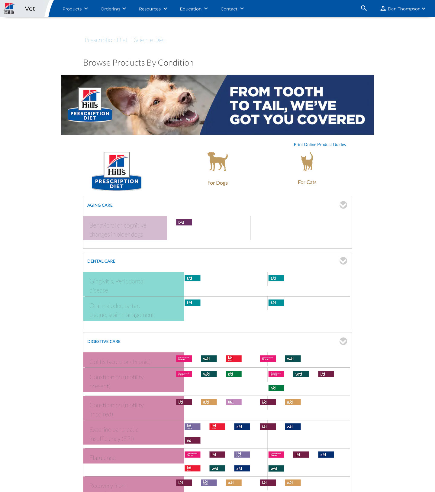
The existing page organized content as a series of top-level accordions — one per condition category — which expanded to reveal a table of co-conditions and their associated product lines. Users had responded positively to the accordion pattern itself, so that wasn't the issue. The problems ran deeper:
- Information density without hierarchy. The table inside each accordion presented sub-conditions and product lines as a flat grid of colored icons. There was no clear visual hierarchy — everything competed equally for attention, making the page hard to scan and slow to use in a clinical setting where time matters.
- No inline product detail. Clicking a product line icon navigated away to a separate page to see individual products. Vets had to bounce back and forth to gather the information they needed to make a recommendation.
- No product comparison. There was no mechanism to compare products side by side — a common need when advising on nutrition for patients with multiple concurrent conditions.
- Accessibility failures. The typography was thin and set against strong background colors throughout, failing WCAG contrast requirements at multiple points in the interface.
Functional limitations
- Preserve the accordion pattern. Users had adapted to it and liked it. The goal was to fix what was inside, not replace the model.
- Mobile-first. Despite the user base skewing desktop, any solution needed to be responsive and usable on mobile.
- Maintain product line color coding. Each Hill's product line has a distinct brand color that vets had learned to use as a visual shorthand. That system needed to carry forward.
- Development constraints. The comparison feature had to be implementable within the existing development environment — no custom builds.
Design decisions
Sub-accordions with colored spines
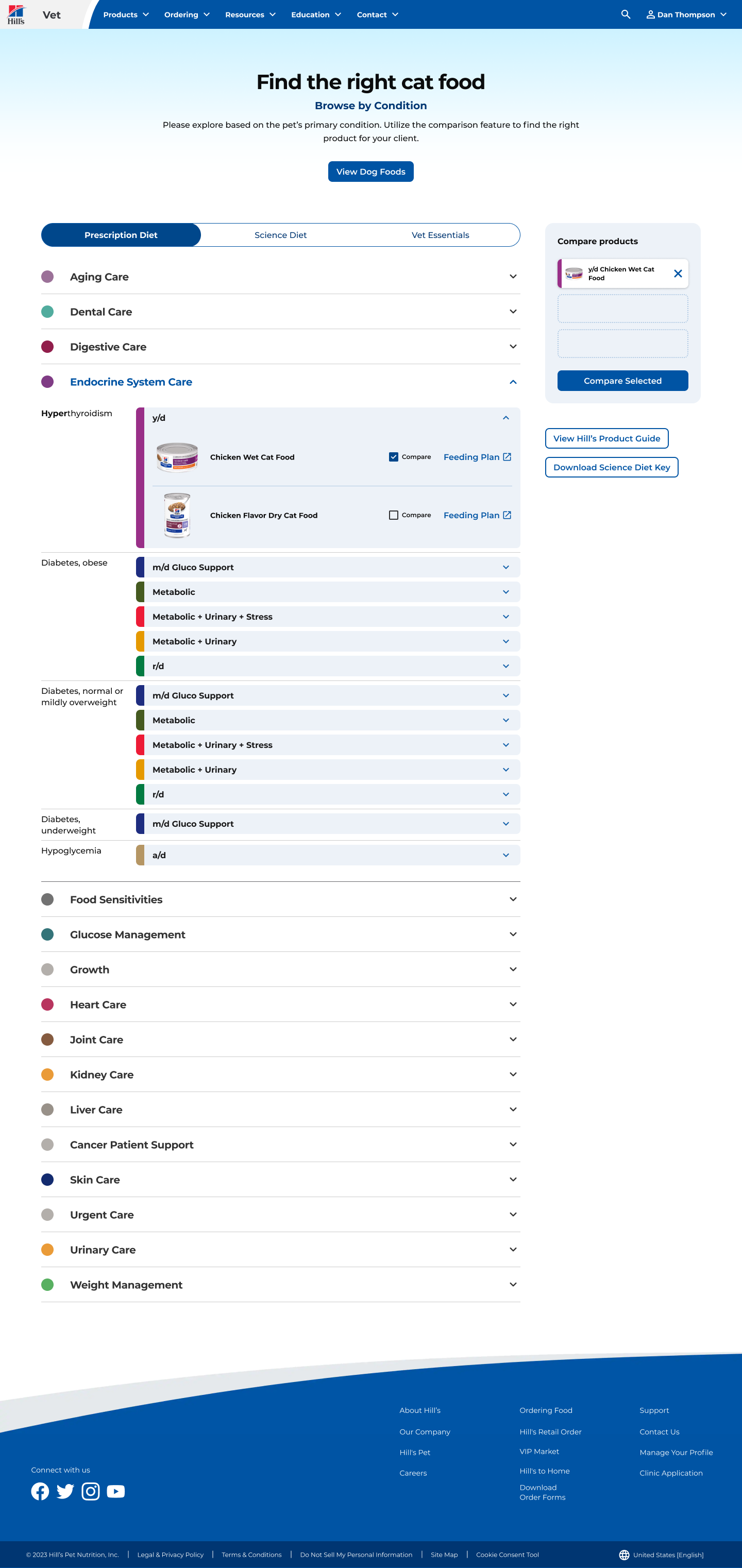
The most significant structural change was replacing the flat icon grid inside each top-level accordion with a nested sub-accordion system. Each sub-condition becomes its own expandable row, and expanding it reveals the individual products within that product line — without leaving the page.
To preserve the product line color coding that vets relied on, each sub-accordion has a colored vertical spine on its left edge. The spine is always visible regardless of whether the accordion is open or closed, giving users persistent color context as they navigate. This kept the color-as-signal system intact while integrating it into a more useful structural format.
Inline product cards
With sub-accordions in place, individual products could be surfaced directly within the page. Each product entry shows the product name and image, and includes a checkbox for comparison and a direct link to the feeding plan. Vets get the information they need without navigating away.
Comparison sidebar
To support product comparison without requiring a separate page, a sticky sidebar panel tracks selected products. Users can check up to three products from anywhere on the page, then trigger a modal with a side-scrolling comparison table. Given the development constraints, this was the lowest-friction path to a working comparison feature — and it keeps the comparison action always visible without disrupting the browsing flow.
Typography and accessibility
The previous interface used thin type weights set against heavily saturated background colors, creating contrast failures throughout. The redesign reworked the type system to meet WCAG AA compliance across all text and interactive elements, with improved weight selection and better color pairings.
Measurably less friction, measurably more confidence
The redesign shipped to a positive response from both the Hill's team and the veterinary professionals using the tool. The inline product detail reduced the back-and-forth that had slowed the previous experience, and the comparison feature addressed a gap that had existed in the tool for years. The colored spine system successfully carried the product line color language forward into the new format without losing the visual shorthand vets had built around it. The client was confident the page would continue to be a primary reference tool for their customers.
Kansas City Zoo Map