UX/UI Design
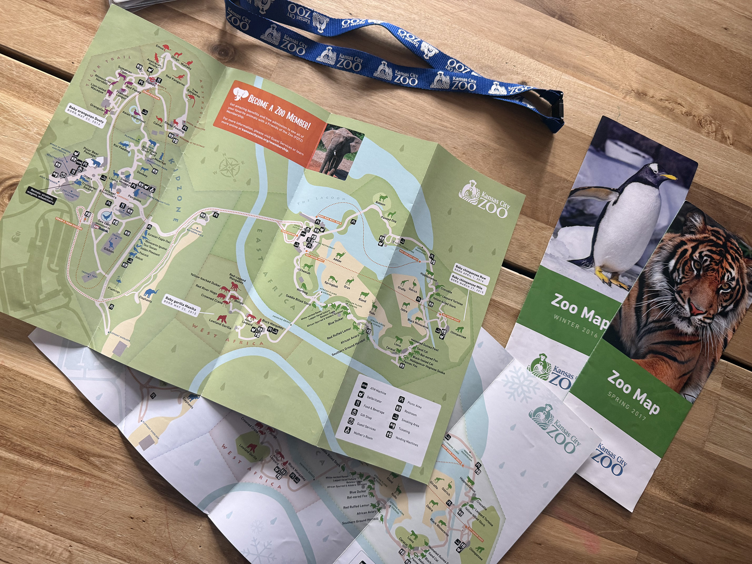
Kansas City Zoo Map
Leveraging a ground-up redesign of the park map as an experience ambassador and genuinely
Designing a new park map for print and digital experiences
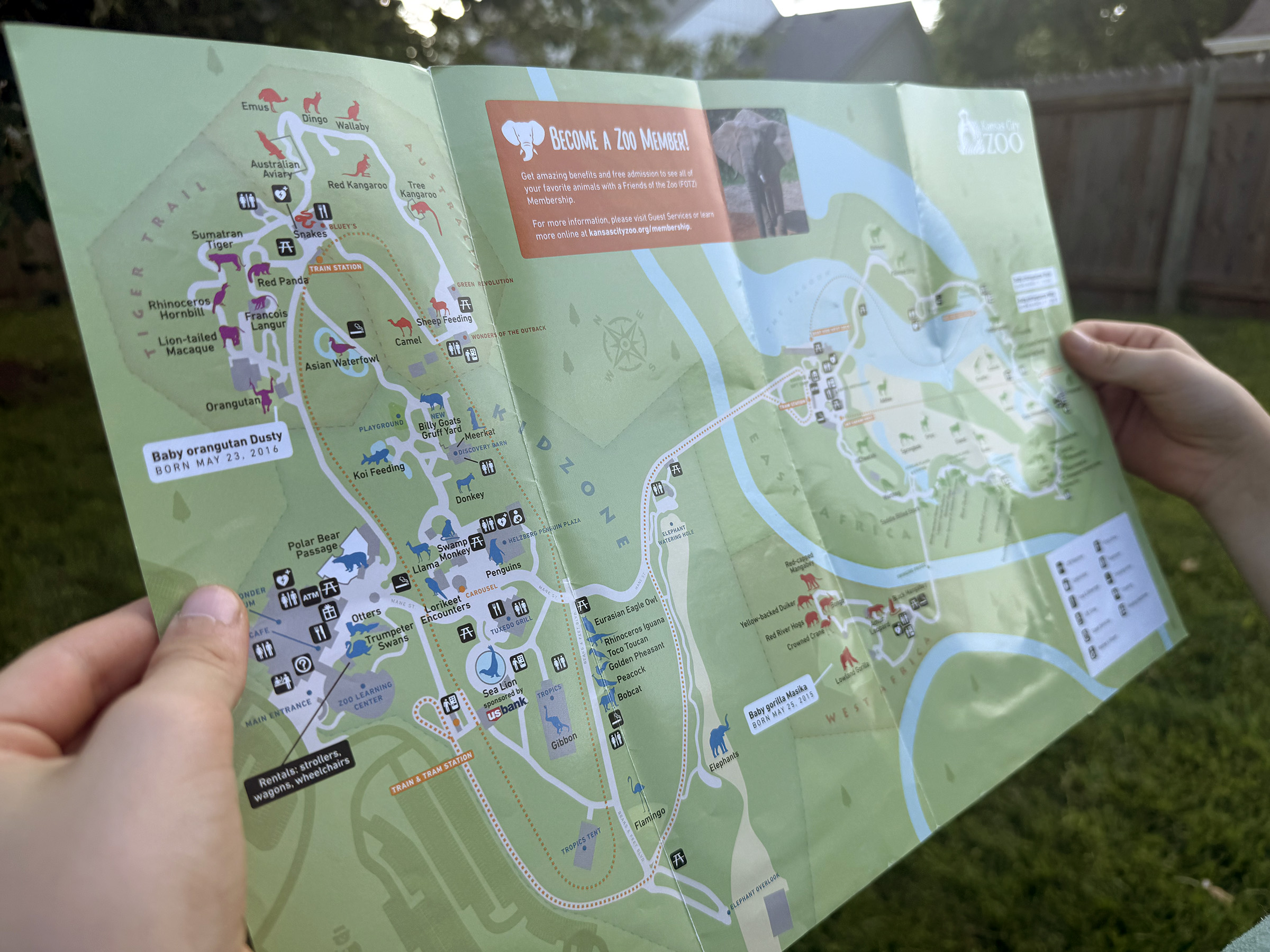
There's something about a well-designed map that feels inseparable from the experience itself — the anticipation of planning your day by pre-exploring the park with the map. When the Kansas City Zoo approached my agency about updating their park map, I was genuinely excited. The existing map had real problems I'd been mentally redesigning since my own visits, and I had a lot of ideas.
The map was struggling with user comprehension in a few specific ways: it didn't accurately reflect distances or geography, making day-planning harder than it needed to be. It lacked sufficient landmark detail. And it felt visually flat — not the kind of thing that excites you about what you're about to experience. A zoo map isn't just a navigation tool. It's often the first thing a guest engages with, and for many it's how they decide what to prioritize. It needed to do more than point people in the right direction.
Identifying areas to improve
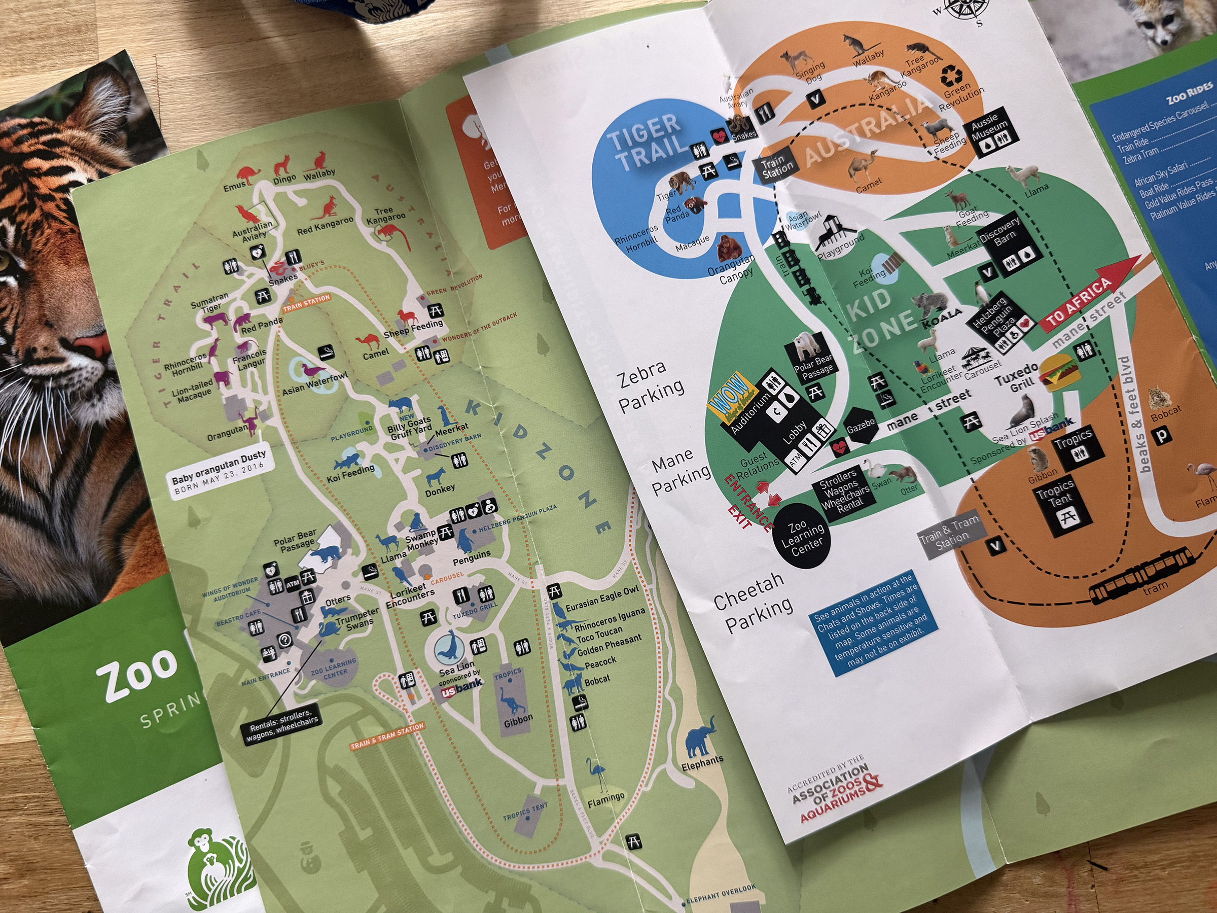
- Split layout — The zoo's two main areas are separated by a river, and the old flyer addressed this by putting each side on opposite faces of the print piece. This meant guests could never see the whole park at once, and had no real sense of how the two halves related to each other spatially.
- Geographic inaccuracies — The original map used an abstracted layout that distorted relative distances and directions significantly. Guests couldn't reliably gauge how far apart exhibits were, which made planning a route across the park — especially with kids — genuinely frustrating.
- Insufficient detail — Several exhibits, buildings, and facilities weren't represented at all, leaving gaps that undermined the map's usefulness for first-time visitors.
- Weak iconography and typography — The labels and icons were difficult to read and didn't make the park feel exciting. For a place full of animals and experiences worth anticipating, the map felt remarkably inert.
- No digital experience — The zoo's online map was simply a downloadable PDF of the print flyer — not a great experience on any device, and essentially unusable on mobile.
A digital-oriented approach to map usability
From the start, there was an ambition to build this map right — not just for print, but as the foundation for a fully interactive digital experience. The plan included an interactive web map with rollover information on each landmark, and potential future features like GPS-based "you are here" tracking and NFC devices placed around the park. To make any of that feasible, the map needed to be as geographically accurate as possible from the ground up.
An editable Adobe Illustrator file was ultimately required to design the map, so I needed to find a way to convert latitude/longitude coordinates into something usable in the design software.
Building the foundation: geo-accuracy
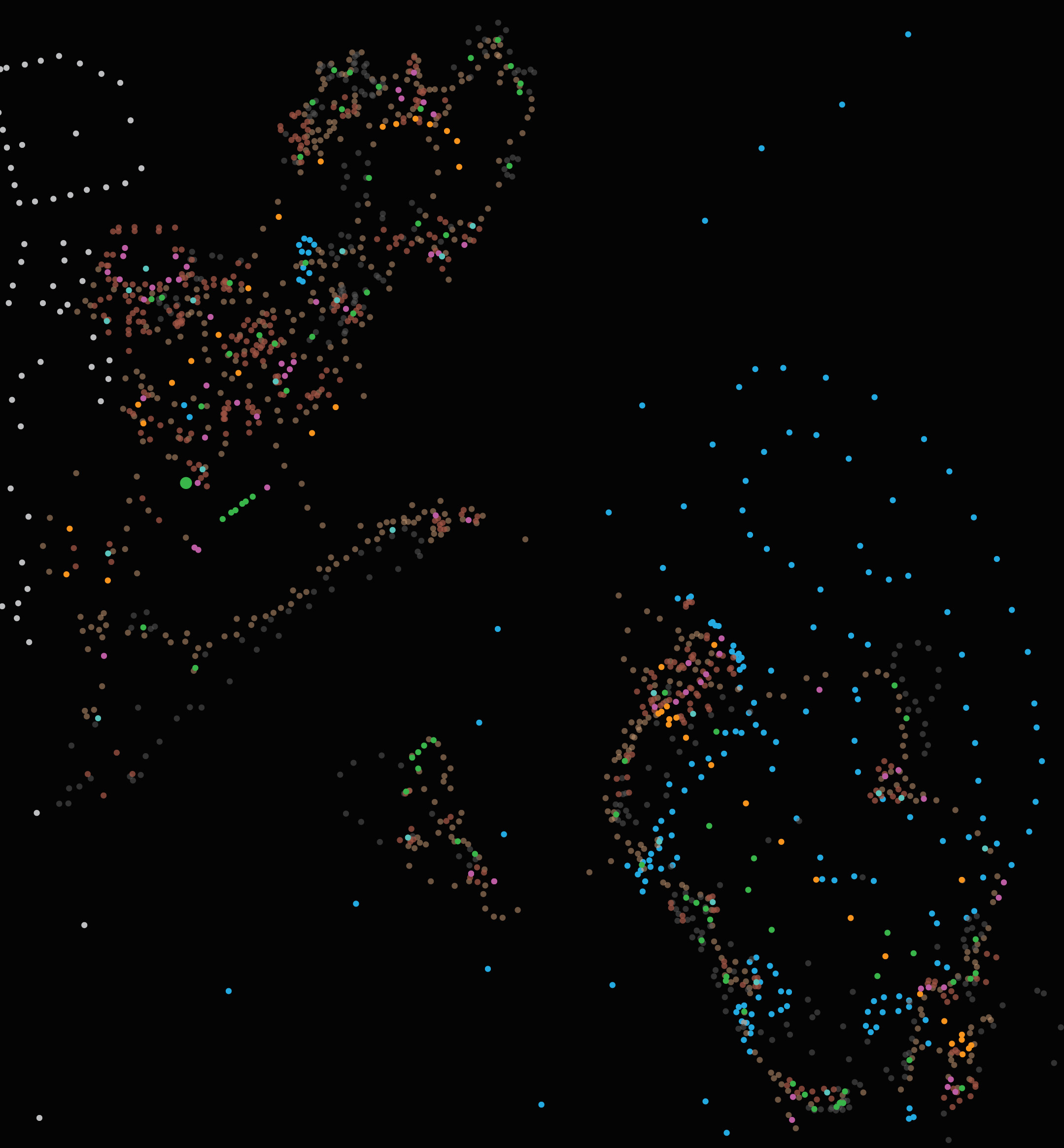
The first phase was the most technically intensive: documenting accurate coordinates for every exhibit, building, facility, and pathway in the zoo.
I gathered location data using a combination of a handheld GPS device on-site and precise coordinate extraction from Google Earth, recording everything into a spreadsheet. I then used an online coordinate converter to translate the latitude/longitude values into x/y coordinates, which I imported into Illustrator as the skeleton for the map. Paths and landscape features were traced using Google Earth as a reference for accurate shape and proportion. In total, I mapped over 1,800 coordinate points.
The result was a wireframe that was true to the actual geography of the zoo — something the original map had never been. Every path, every exhibit placement, every relative distance was now grounded in reality.
This accuracy never made it fully to fruition for the GPS and NFC features, but it paid off immediately in the print version: guests could now look at the map and trust that what they were seeing reflected the actual experience of moving through the park.
Filling out the frame
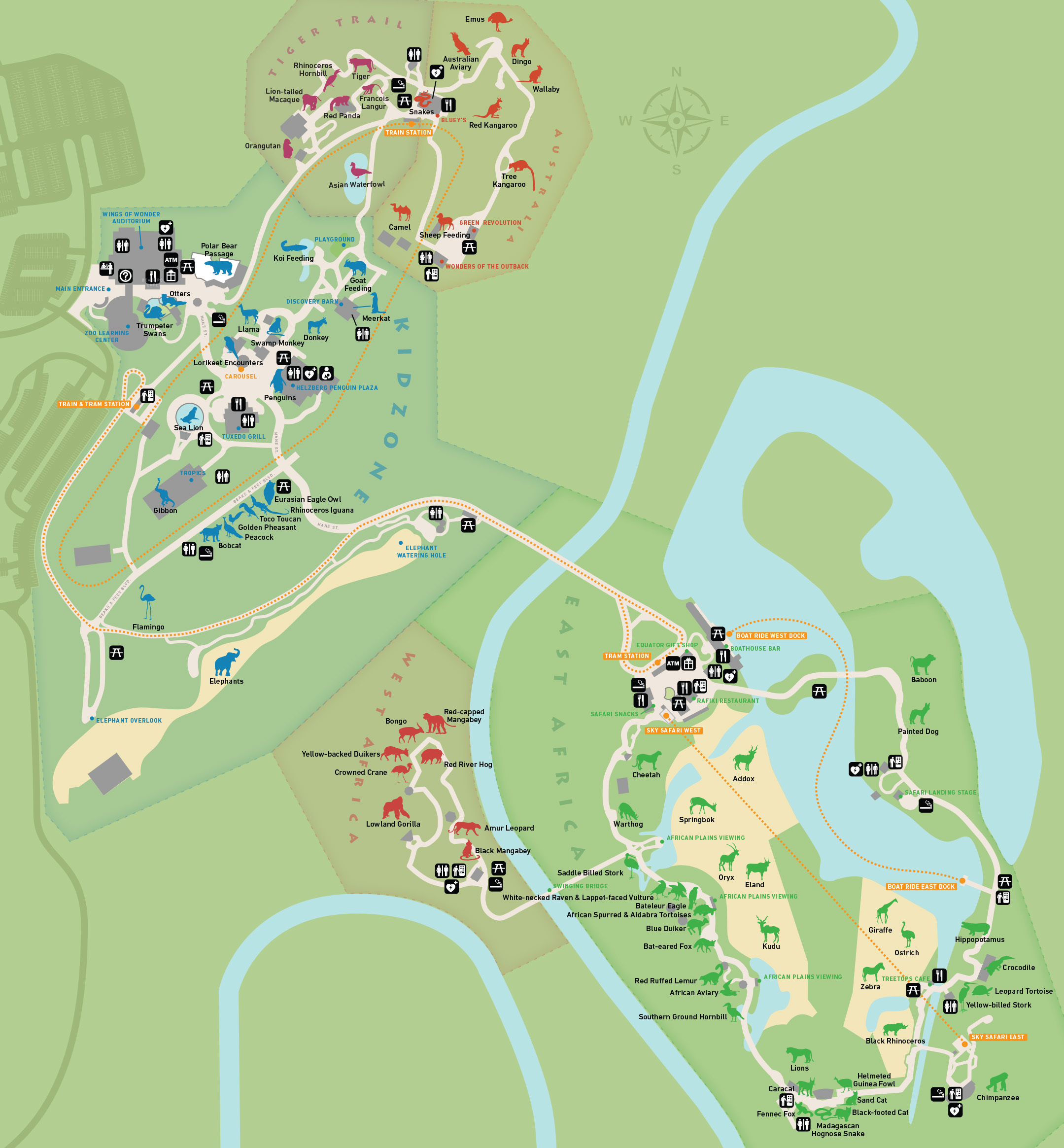
With the wireframe complete, I turned to the visual design of the map itself.
- Color and typography were informed by a broader brand refresh my agency was simultaneously developing for the zoo. I collaborated on the color palette and typography selections for that project and carried those choices into the map, with some modifications where usability required it — for instance, ensuring sufficient contrast between path colors, zone colors, and label text.
- Iconography was designed from scratch. I created a custom icon set representing animals, facilities, and points of interest throughout the park, prioritizing legibility at small sizes and a consistent visual style that felt fun without being childish.
- A unified layout replaced the two-sided split. By designing a single cohesive map that captured both sides of the river, I was able to give guests a complete picture of the park in one view — which made orientation and planning significantly more intuitive.
My goal was a map that was primarily practical, but also genuinely enjoyable to read. I thought of it as an "activity ambassador" — something that could excite a guest about what they were about to experience, not just route them through it. The zoo map was one of the most visited pages on their website, and we knew that many users consulted it before ever arriving. A more engaging, accurate map could do real work in shaping those expectations.
Results and impact
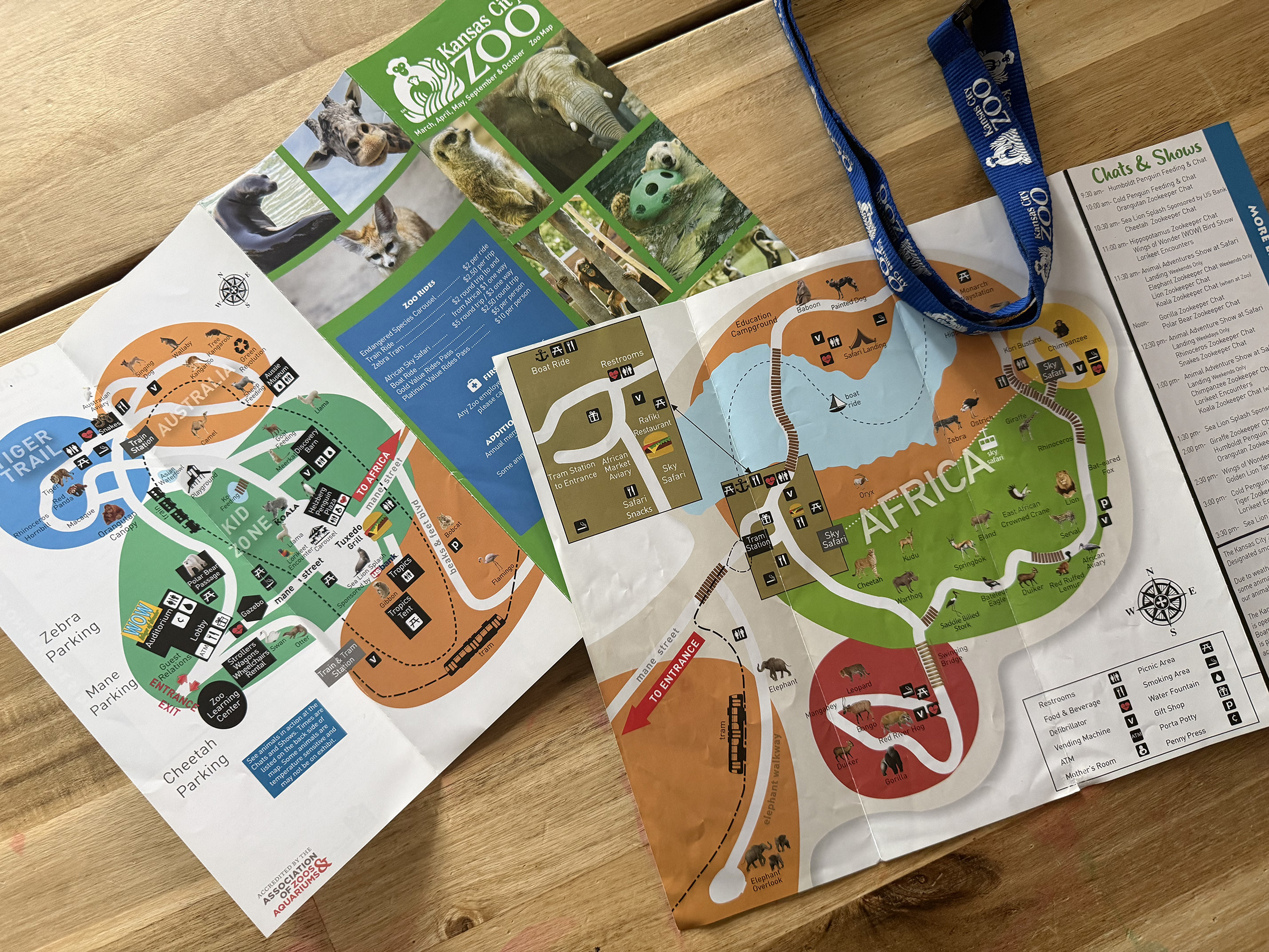
The feedback from the zoo's marketing team was positive, and the map went into production for both print distribution and in-park signage.
What I'm most proud of: nearly a decade later, the map is still in use. I still have a family season pass to the KC Zoo, and every time I'm there with my kids I see my map on the signage and in the brochure racks. There aren't many projects in a designer's career where the work has that kind of longevity in a place you personally visit — that one's stayed with me.
Lessons learned
Looking back with fresh eyes, there are two things I'd do differently.
- Photography over icons — I went with illustrated icons partly to save time and partly out of concern that animal photos might look inconsistent or cheap. I think that was the wrong call. Small, well-treated cut-out photographs of the actual animals would have made the map more emotionally engaging and easier to read — the icons are functional, but photos would have brought it to life in a way the icons don't.
- Slightly larger type — We pushed hard to get the map printed on larger flyers, and I used that extra real estate to keep labels tight. In hindsight, I was too conservative. The type is readable, but a few points larger across the board would have made it significantly more accessible for guests with poorer eyesight — an important consideration for an audience that includes older visitors and parents who are already juggling a lot.
Both are relatively small things, and neither undermines what the map accomplishes. But they're the details I notice every time I pick one up at the gate.
IHOPU Website