UI/UX Design & Front-end Development
IHOPU Website
A new website design built to meet the needs ot students and staff, with a modular system for long-term sustainability.
A new website for a growing school
IHOPU — International House of Prayer University — was a ministry training school offering one-to-four year programs in theology, music, and media. The school was growing, but its web presence hadn't kept pace. The site existed only as a section buried within its parent organization's larger website, which meant limited content flexibility, constrained design options, and a development environment that made even minor updates a slow process.
I was brought on to design and build an independent site from the ground up — one that could grow with the school, serve prospective students clearly, and be maintained by staff without ongoing developer involvement.
Insufficient web presence for a growing school
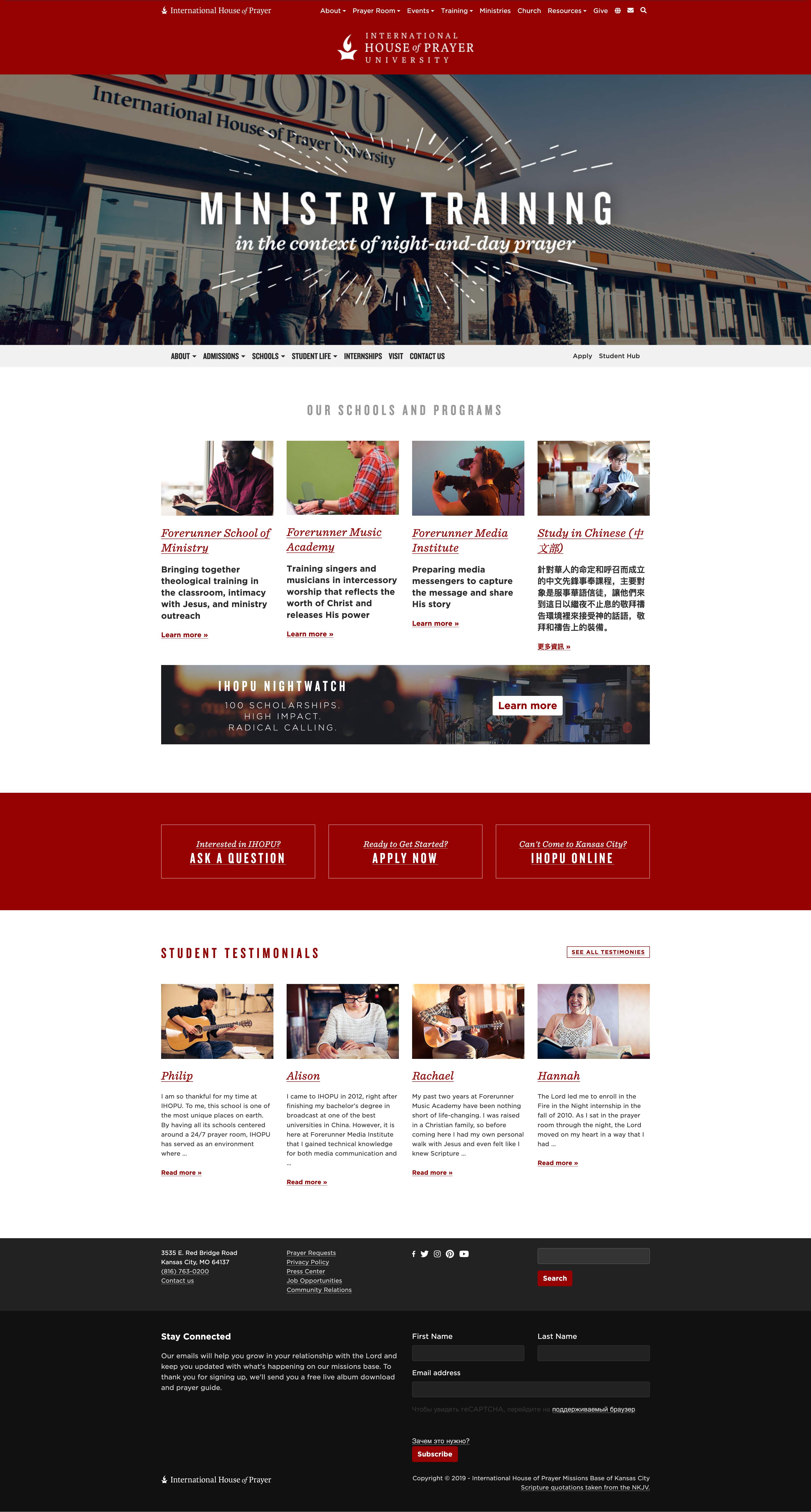
The existing IHOPU web presence was difficult to find, harder to navigate, and nearly impossible to update. Because it lived within the parent organization's dev environment, any content changes had to move through a shared pipeline that wasn't built around the school's needs. The result was a site that felt like an afterthought — minimal information, dated aesthetic, and no clear path for prospective students.
As the school expanded its programs and student body, the gap between what the site communicated and what IHOPU actually offered became a real liability.
Planning to meet the needs of students and staff
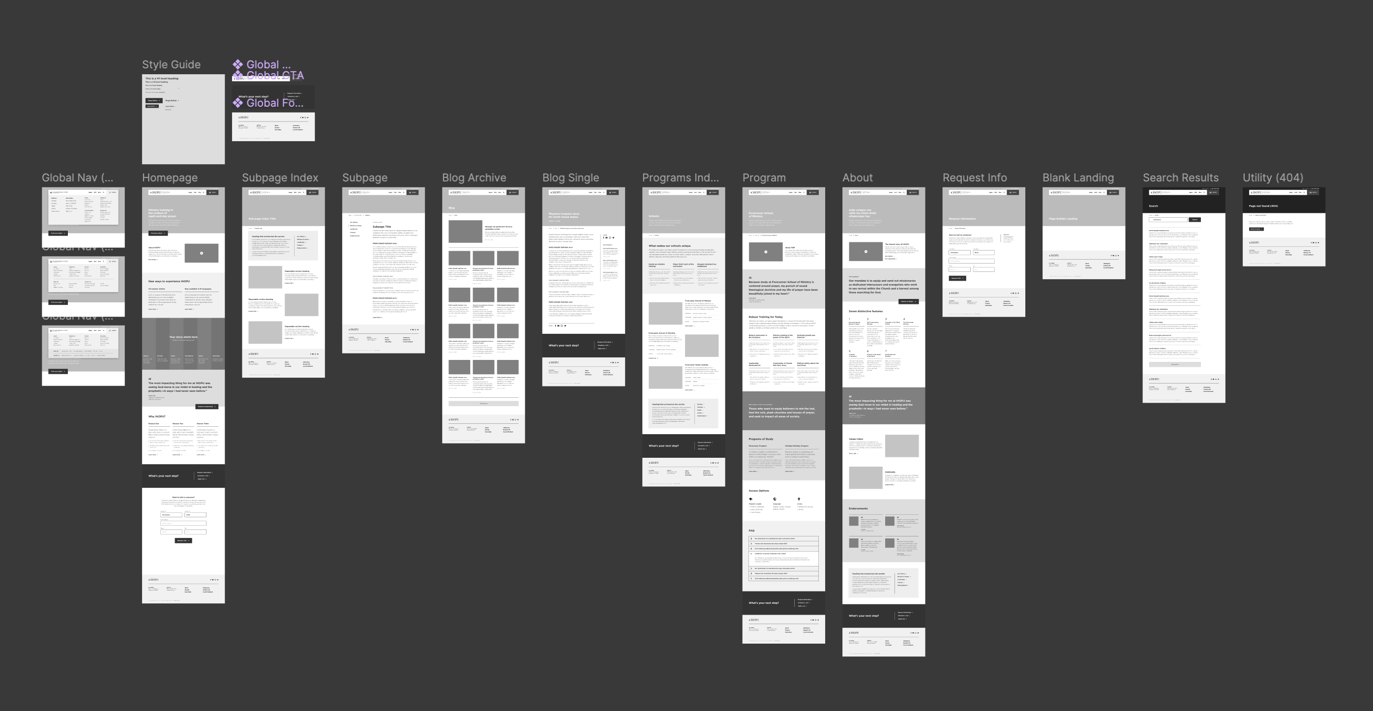
Discovery & Wireframes
Before any visual design work began, I worked through a thorough wireframing process to map out content structure and user flows across every page type — homepage, program index, individual program pages, blog archive, about, request info, and utility pages like search results and 404.
The goal was to establish clear, intentional paths through the site: prospective students needed to quickly understand what IHOPU offered, find the program relevant to them, and take action — whether that was applying, requesting info, or exploring further. Every layout decision at the wireframe stage was made in service of those flows before a single visual choice was made.
Technical Foundation
For the build, I chose Sage as the WordPress starter theme — built on Laravel Blade components, it offered the flexibility and developer tooling I needed to build something robust without starting from scratch.
The more important technical decision was how to make the site sustainable after launch. I built the theme around Advanced Custom Fields (ACF), designing a library of modular, reusable page sections — each one a Blade component wired to ACF fields for content and imagery. The result was a fully user-editable page-building system that let IHOPU staff create and update pages on their own while remaining brand-compliant. No designer or developer required for day-to-day content work.
I also implemented a fluid sizing system using a custom SASS mixin. Rather than relying on hard breakpoints, elements were given a minimum size for mobile and a maximum for desktop, scaling smoothly between the two. This meant layouts stayed proportional at any screen width — no awkward in-between states where the design broke down before the next breakpoint kicked in.
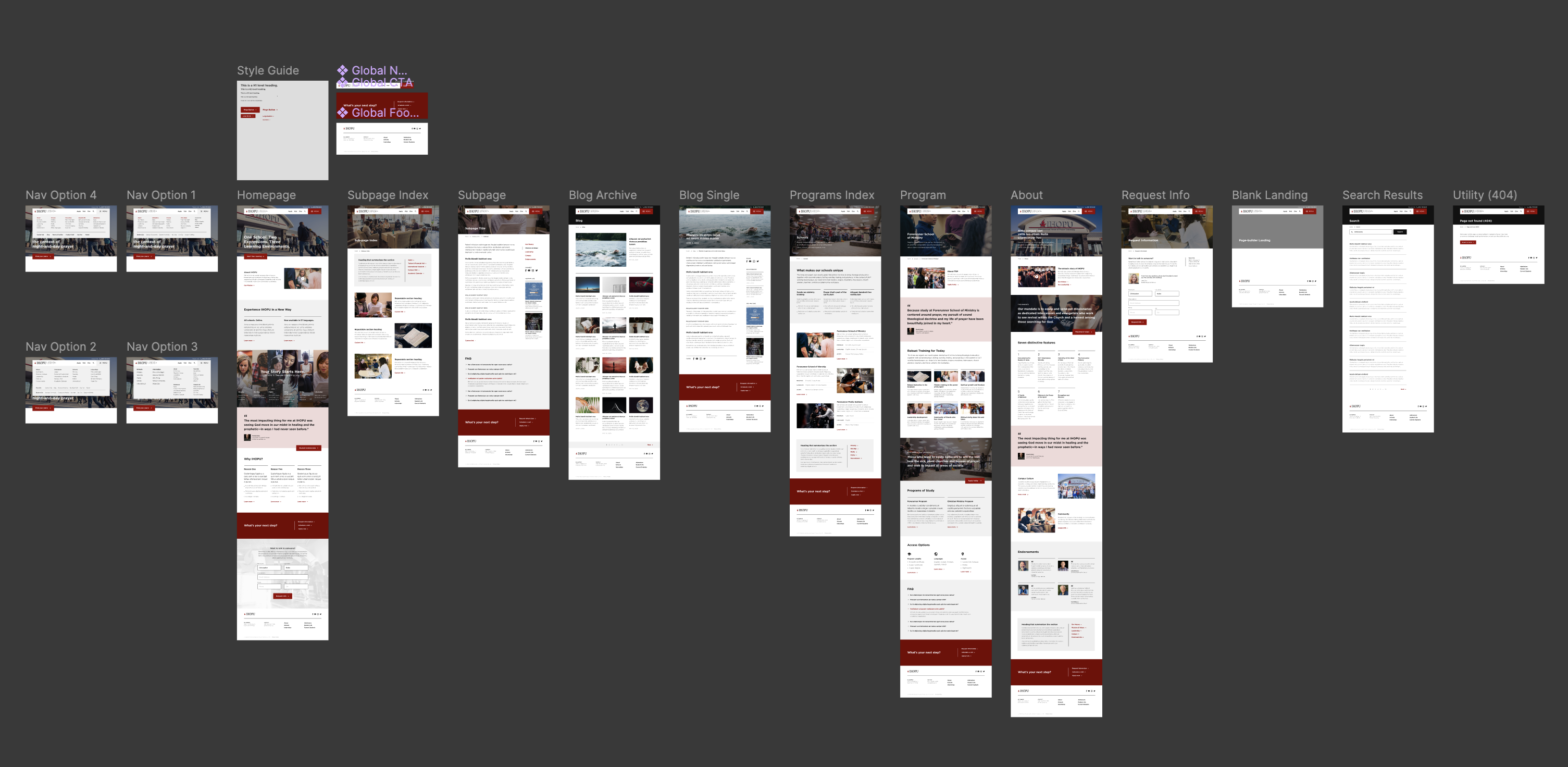
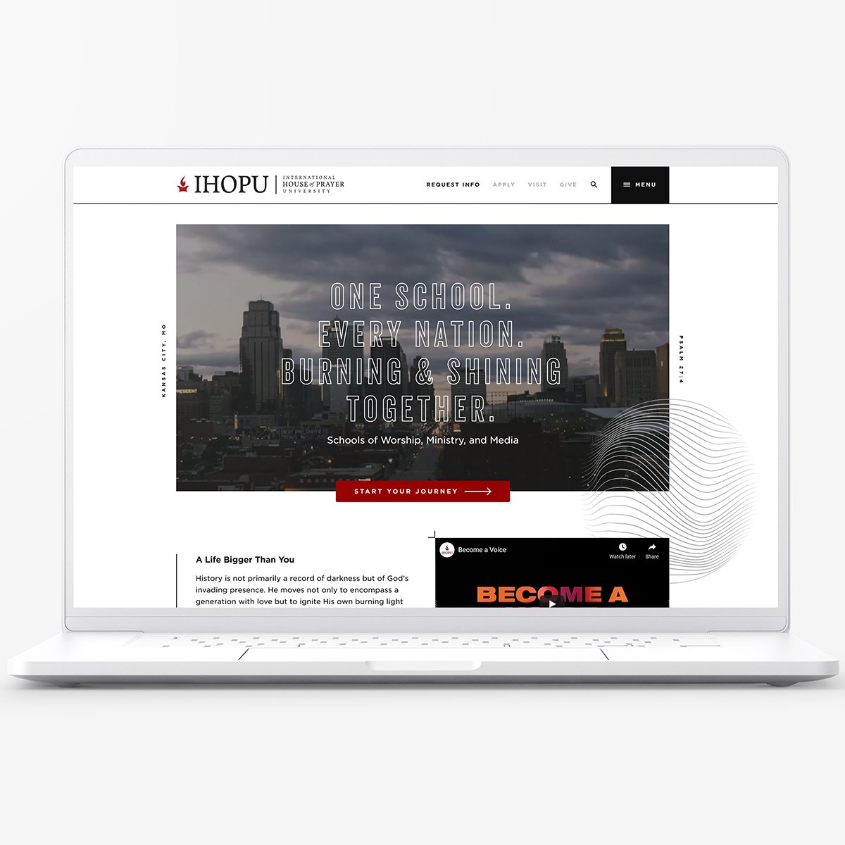
Clean and modern with a youthful edge for brand longevity
The initial design direction took a more conservative, polished approach — clean, structured, and in line with what had been approved through the design review process. After I moved into development, the client came back with a request to recalibrate: they wanted something with more energy and edge — a look that would resonate with a younger prospective student audience.
Because I was the sole designer and developer, the pivot was clean. I could move quickly without coordination overhead, and the modular system I'd already built meant style-level changes didn't require rebuilding from the ground up. The revised direction pushed the visual identity toward something bolder and more contemporary while preserving the content architecture and user flows we'd worked hard to establish.
A successful launch that exceeded expectations
The new site launched to a strong reception from the client. Staff were able to manage content independently from day one — a meaningful shift from the constraints of the previous setup. The site's longevity reflected how well the system held up: it ran for several years with minimal developer intervention.
On the metrics side, the impact was concrete. User retention improved, and application volume saw a measurable increase after launch — a direct signal that clearer content architecture and a stronger first impression were converting prospective students who previously would have bounced.
Lessons learned and future considerations
This project is a good example of how design and development overlap in practice. The most consequential decisions weren't purely visual — they were architectural. Building a theme that non-technical users could actually own and operate long-term required thinking through the content model, the component structure, and the editing experience as carefully as any page layout.
The mid-project style pivot was also a useful reminder that flexibility in the design process — especially when one person holds both roles — is a real asset. What might have caused significant delays on a larger team was a manageable course correction here, and the end result was stronger for it.
Hill's Browse by Condition